Button Block
The Button Block allows you to add one or more styled buttons to your page.
Button Menu
Clicking a button reveals the button menu.
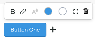
The buttons in the menu include:
- Bold: Makes the text of the button
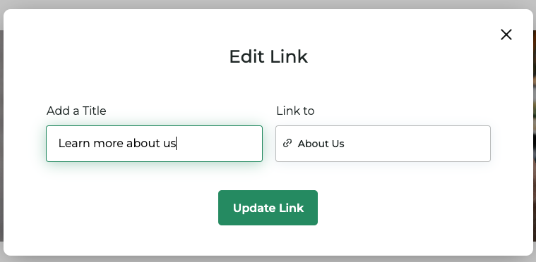
- Link/Text: Click here to update the text of the button and control where it links to.
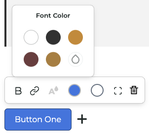
- Text color: Opens a color picker to change the text color of the button.
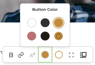
- Button color: Opens a color picker to change the background color of the button.
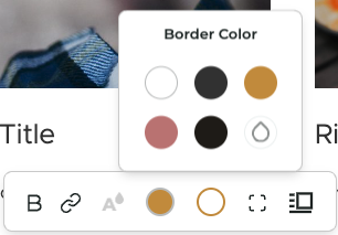
- Border color: Opens a color picker to change the border color of the button.
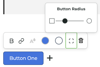
- Border radius: Adjust how rounded the button will be.
Button Properties Panel
The Button Properties Panel allows you to customize the appearance of the button.
The properties include:
- Text: The text displayed on the button.
- Link: The URL the button links to.
- Text color: The color of the text on the button.
- Button color: The background color of the button.
- Border color: The color of the border around the button.
- Border radius: The roundness of the button's corners.
Button Properties Panel
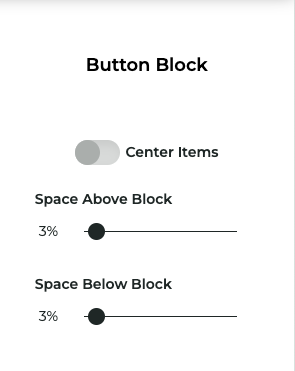
Click the dot options menu button in your Button Block to access the Button Properties Panel. The panel includes some shared block properties as well as the option to center align all buttons in your block.